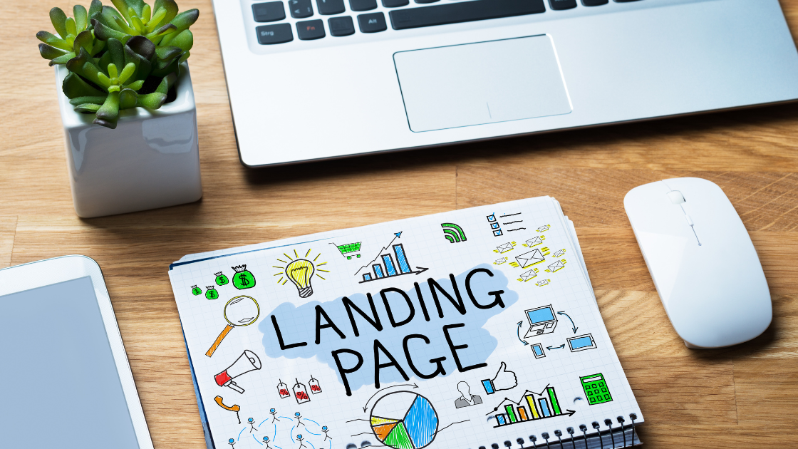
Are you looking to optimize your landing page to maximize your conversion rate?
A landing page is a crucial element of your digital marketing strategy. It’s where potential customers land after clicking on an ad, social media post, or email marketing campaign.
So, it’s essential to ensure that your landing page is optimized to convert visitors into customers.
Here are some tips on how to optimize your landing page to maximize conversion rate:
- Keep it simple: The first rule of a good landing page is to keep it simple. Your landing page should be visually appealing, easy to read, and have a clear call-to-action (CTA). A cluttered landing page can confuse visitors and drive them away.
- Focus on the headline: Your headline should be attention-grabbing and clearly convey the value proposition of your product or service. Make sure it’s relevant to the ad or campaign that brought the visitor to the landing page.
- Use high-quality images and videos: Images and videos can help to break up the text on your landing page and make it more visually appealing. Use high-quality images and videos that are relevant to your product or service.
- Create a sense of urgency: Creating a sense of urgency can help to encourage visitors to take action. Use phrases like “limited time offer” or “while supplies last” to create urgency.
- Make your CTA prominent: Your call-to-action should be prominently displayed on your landing page. Use contrasting colors and make it stand out from the rest of the page.
- Test different variations: A/B testing is a great way to optimize your landing page for conversion rate. Try different variations of your headline, images, and CTA to see what works best.
- Mobile optimization: More and more people are using their mobile devices to browse the internet. So, it’s crucial to ensure that your landing page is optimized for mobile devices. Use responsive design to ensure that your landing page looks good on any device.
Here are a few examples of landing pages that are optimized for conversion rate:
Airbnb: Airbnb’s landing page is visually appealing and straightforward. The headline clearly conveys the value proposition of the service, and the call-to-action is prominently displayed.
Slack: Slack’s landing page is another great example of a simple and visually appealing landing page. The headline clearly conveys the value proposition of the product, and the call-to-action is prominently displayed.
HubSpot: HubSpot’s landing page uses high-quality images and videos to break up the text and make it more visually appealing. The call-to-action is prominently displayed and stands out from the rest of the page.
In conclusion, optimizing your landing page for conversion rate is essential to the success of your digital marketing campaign.
Keep it simple, focus on the headline, use high-quality images and videos, create a sense of urgency, make your CTA prominent, test different variations, and optimize for mobile devices.
By following these tips and examples, you can create a landing page that blows your mind and converts visitors into customers.
If you need help optimizing your landing pages and improving your digital marketing campaigns, don’t hesitate to contact us at AS Digital today. Our team of experts can provide customized solutions to help you achieve your business goals.

